We talked about the first 5 steps of creating a refined sketch from a white canvas in my previous post . We now have a completed sketch, so what’s next? It’s painting time! To keep things interesting, I will use another example in this post. Here’s the final sketch of the illustration.
Step 5 - Colour Plan
Since the girl and the fish are the main characters, I want them to catch the audience's attention with a bright mustard yellow. Here’s my colour plan...
Yup... As you can tell, I didn’t do any colour planning at all, apart from the main characters, because I’m really bad at following plans, especially my own. I usually figure it out along the way. Of course, this is the privilege of using digital media, as colours can be changed easily.
For those who use traditional art materials, do you do any colour planning, or do you just decide as you paint?
I know colour planning would save me a lot of time, so I should definitely start learning to do that.
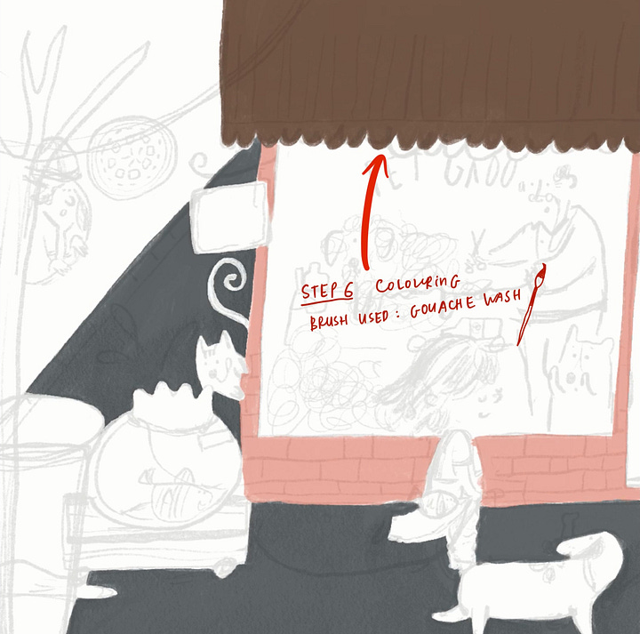
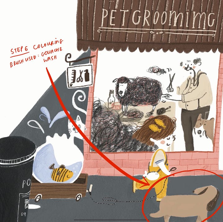
Step 6 - Colouring


In this step, we start blocking in the colours of the main shapes. I like to call them base layers.
I normally use the watercolour brush or gouache wash brush (I purchased mine from Bardot Brush) for this step. These brushes allow me to create shapes with more wobbly and unexpected edges.
Whenever I want to paint a shape with clean and precise edges, I use the Studio Pen brush.
These are just my personal preferences based on my experience. I suggest you try different brushes to find out which ones suit you best!
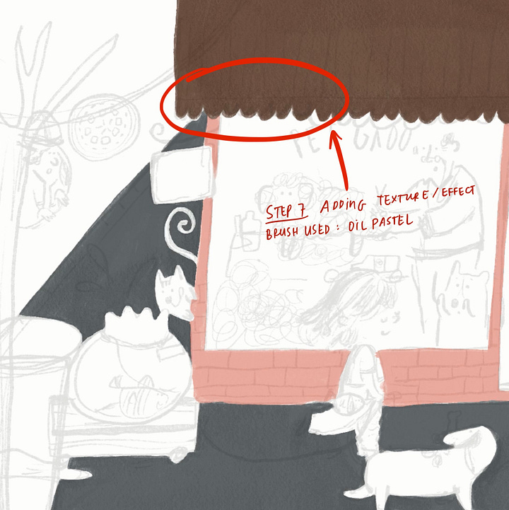
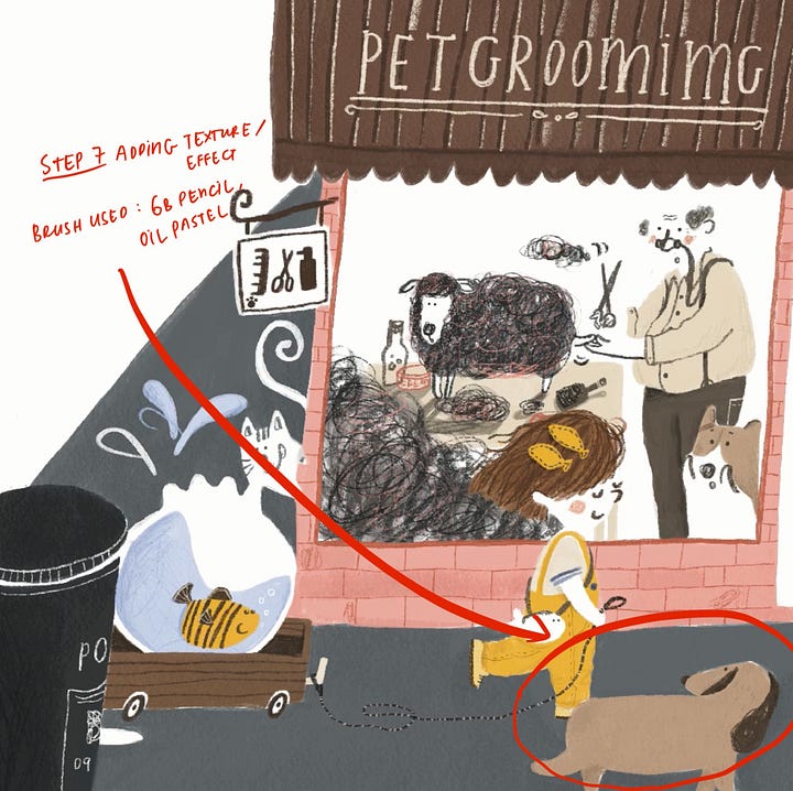
Step 7 - Adding Texture and Shading


After applying the base layers, it’s time to add some texture to make them look "less digital." Alpha Lock is a function that allows you to draw only within the shapes on that layer. By enabling Alpha Lock, you can add texture and shading much more easily.
For adding texture and shading, my go-to brush is oil pastel. Additionally, Procreate's brush library includes several groups—Textures, Charcoals, Elements, Materials, and Organic—that offer a wide variety of brushes for this step. These texture brushes can help create shading and add dimension to objects.
Step 8 - Adding Details
This is one of my favourite steps because it brings your illustration to life. It’s like adding toppings to your pizza or choosing fillings for a Subway sandwich—it's a personal touch that showcases your character in the painting. Although I usually illustrate digitally, I love intentionally including mistakes and imperfect lines to make my work more human. Here's my biggest secret for adding details: draw with your non-dominant hand!
But why? As a perfectionist, I always strive to create a “perfect” painting, which can make my work feel less human and more unrealistic. Using my non-dominant hand means I have less control over what appears on my canvas, allowing me to play like a kid and nourish my inner artist. Give your other hand a try, and it might surprise you!
I am going to talk about how I determine if the colour is right in my illustration in my next post. See you in the next one!
Hope you have a lovely day!
[Disclaimer: This is not a Create-a-Perfect-Painting-Drawing-Guide. This is just the way I personally create. Sharing is caring!]
.


Ulp! Non-dominant hand on final artwork! That's so deliciously rebellious! Going to do it.
Thank you for sharing your process with us 💕 I always feel so overwhelmed with procreate, never know where to go 🤦♀️