


How to Master Colour without Formal Art School Training
for those who struggle with colours like I do

Colours – once my greatest challenge.
It might not seem like it now, but trust me, I still don’t fully understand how colours work. If you take a look at my work, you'll notice my colour palette is quite limited—mostly blue, pink, brown, and yellow.
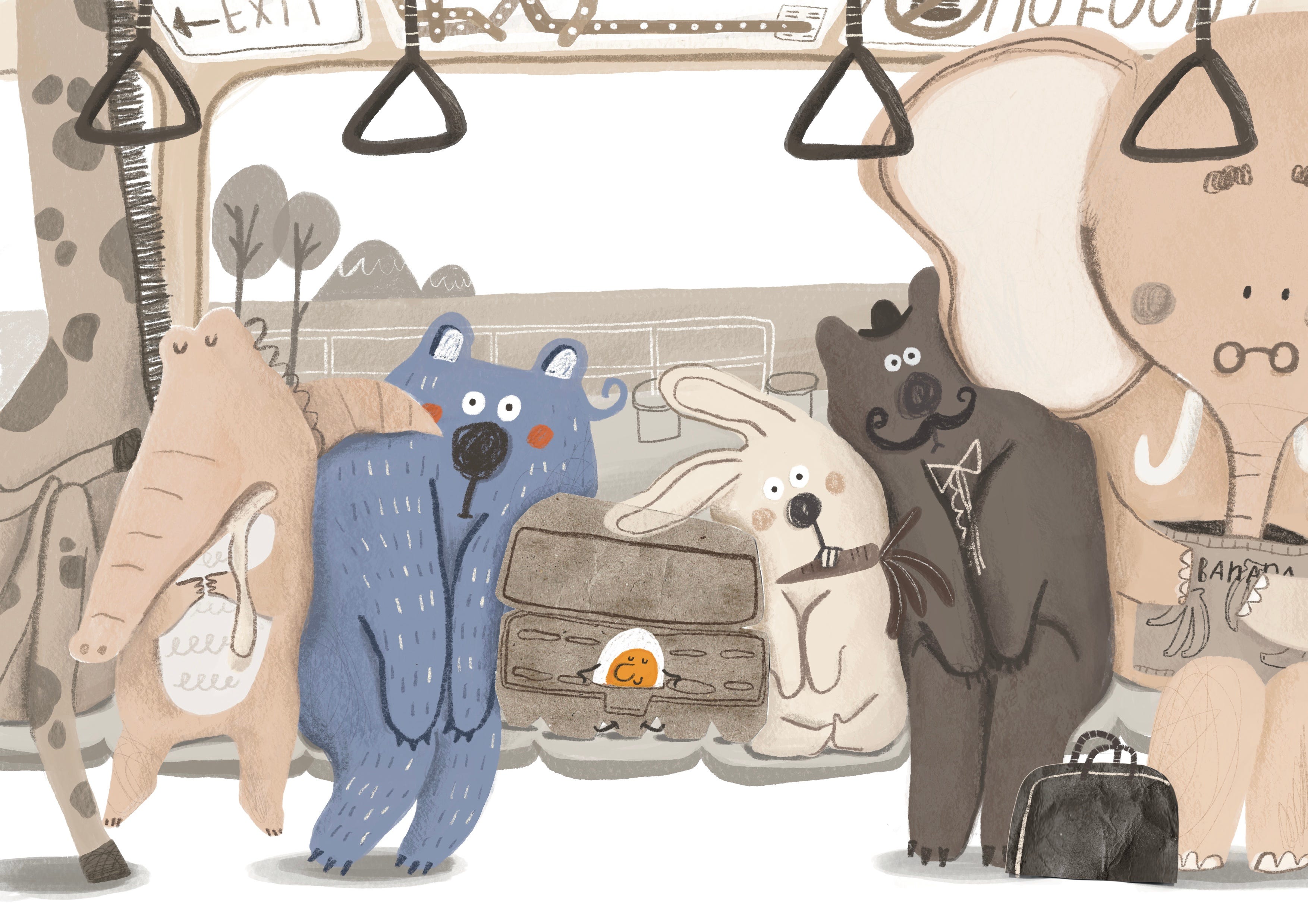
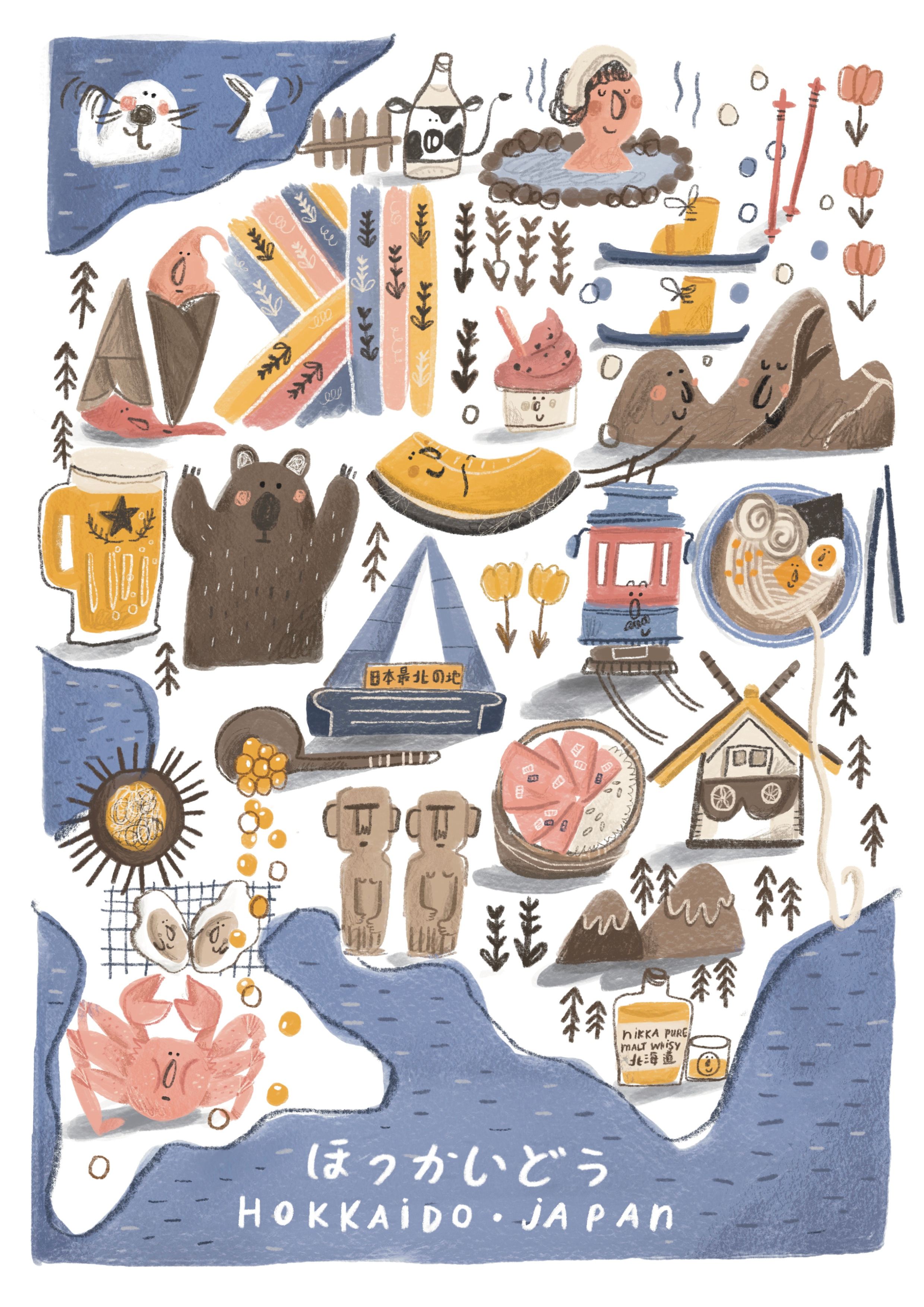
The reason I love using limited palette is simple and straight forward - the fewer colours I use, the easier it is to complete the work. I learned this the hard way, spending weeks just trying to get the colours right for a single illustration, especially when there are over 10,000 colour choices in digital art.
When I first started, I loved using vivid colours like bright red, lemon yellow, and bright green.
My illustrations were bold and eye-catching, just the way I liked them. But as time passed, my taste evolved, and now I’m more drawn to subtle, muted tones. Don’t get me wrong—there’s nothing wrong with using bright and saturated colours. Plenty of AMAZING artists use them brilliantly.
If you’re like me—an illustrator without formal art school training—you probably had no idea what terms like value, hue, saturation, or balance meant when you first started.
Over the years, I’ve educated myself by taking courses, reading reference books, and watching tutorials. I think it’s important to know the basics like colour theory, complementary colours, and primary colours.
But personally, I don’t think this knowledge is necessary to be a great artist. I’ve realised the best way to learn about colours is to LOOK and TRY, just like with everything in life.
LOOK—Observe the colours around you.
What colour is the sky? What colour is that bumblebee? Why did you choose the blue sweater over the red one? Why did the decoration at the coffee shop counter catch your eye? Was it the colour? Why did you pick a beige desk instead of a walnut one?
Take pictures. Take a lot of pictures. Whenever I see a colour combination I love or simply a gorgeous colour, I snap a photo. These photos come in handy when I’m working on a project and need palette inspiration. You can just simply scroll through your phone and browse your reference library (a fancy name for a photo album:P). That’s how you discover your taste.
TRY—You won’t know if the colours you’ve chosen suit you until you try them. Don’t be afraid to experiment. As I mentioned before, be prepared to make ugly drawings. Ugly drawings are part of the process—steps towards growth and self-discovery. You gain something every time you create one. To be creative, you have to let your inner child PLAY. That’s how you discover your preferences.
Try, try, and try again as many times as you can.
How to become the world’s best colour master? I have no clue.
How to master colour in your own creative practice? LOOK and TRY.
Practical stuff -
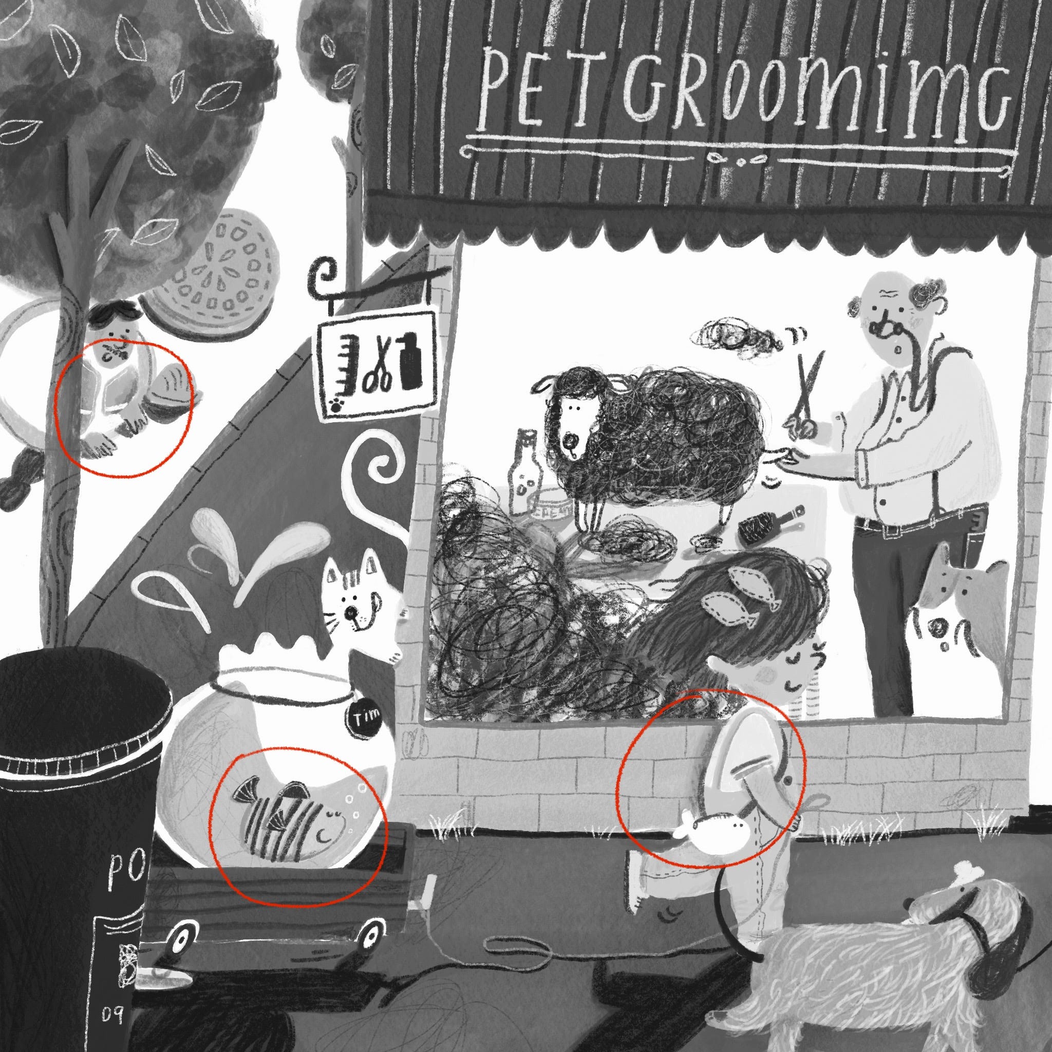
In my experience, colour value is more important than the colour itself. Colour value refers to the lightness or darkness of a colour. If the values of two objects are close, they will seem to blend together, meaning neither will stand out (which is often not what you want). There’s a quick way to check if the values are correct - take a picture of your painting and turn it into a black-and-white photo. If the objects seem to blend together, you can see below—
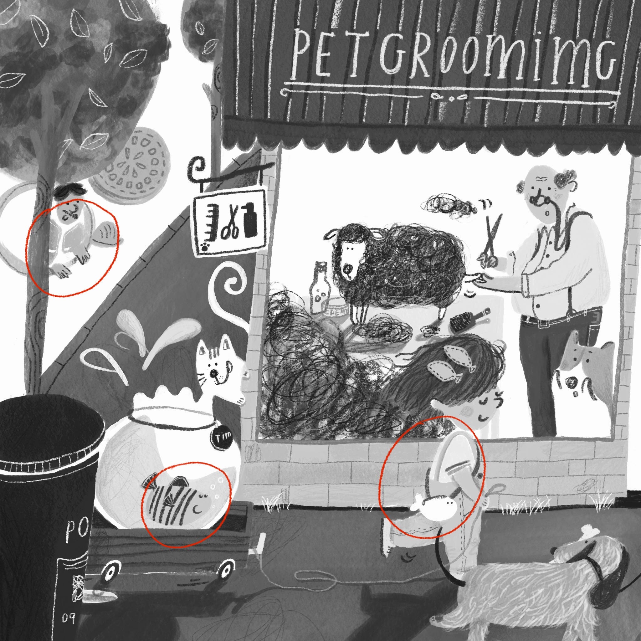
When this happens, I usually add shading to one of the objects. The shading acts like an outline (in a more natural way), helping to distinguish between the two.
Hope you find these helpful. Have a lovely day! :)
[Disclaimer: This is not a Create-a-Perfect-Painting-Drawing-Guide. This is just the way I personally create. Sharing is caring!]
Thank you Teresa! I really appreciate that(still not knowing how colour works😂)
I always found your limited colour palettes so pleasant to see and to stay admiring(zooming🤭) all the details 😍 You may not fully understand how colour works yet, but your work always transmits me the opposite 🤍